Brand Identity
Metrolina Eye
Associates
The brief.
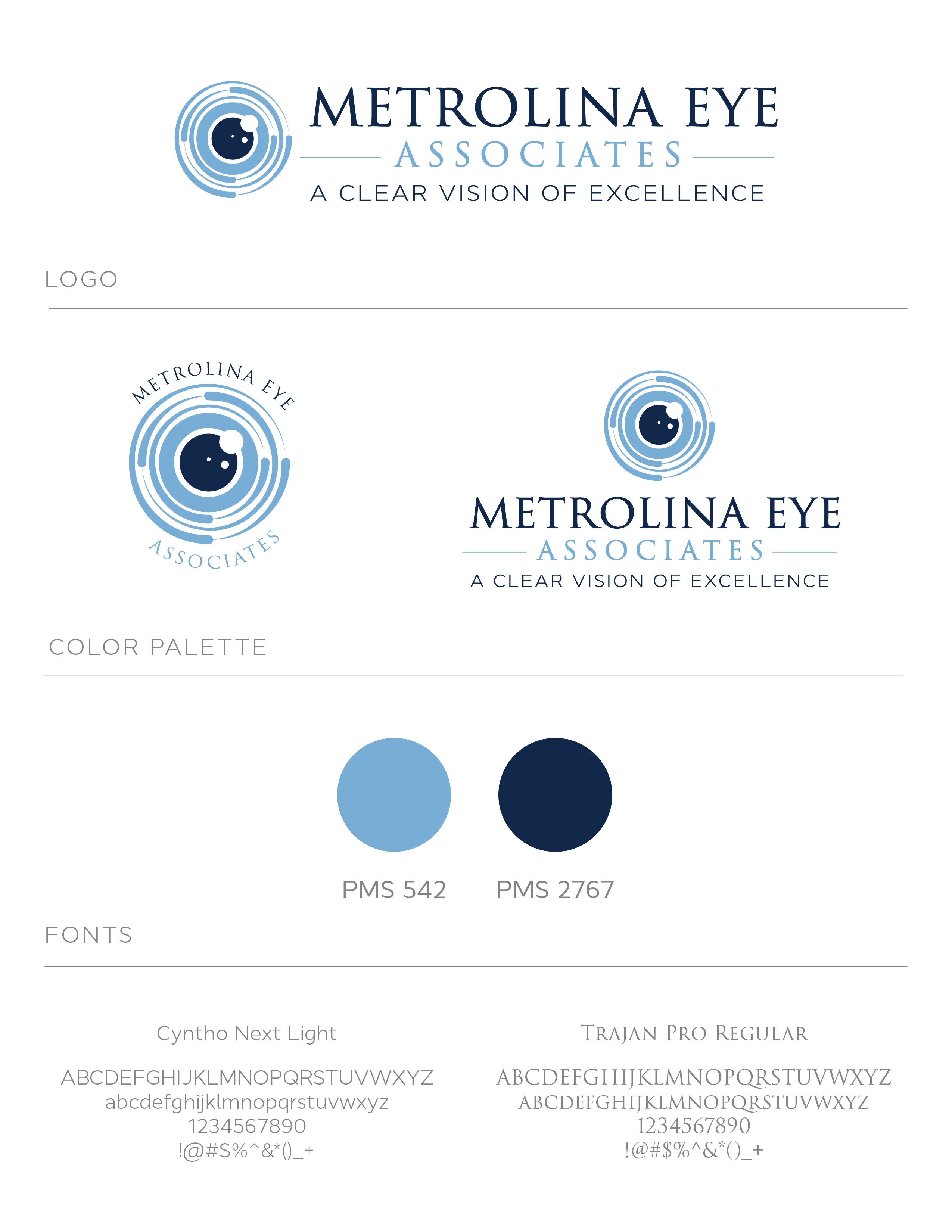
Metrolina Eye Associates had an established presence but a visual identity that no longer reflected the quality of care they provide. They needed a logo refresh that felt contemporary and professional — something that could carry across signage, digital, and print without losing the warmth that defines their patient relationships.
The refresh focused on refining the wordmark, updating the color palette, and introducing a mark that could stand alone across applications — giving the practice a cohesive, polished identity built to last.